


Logo Guidelines
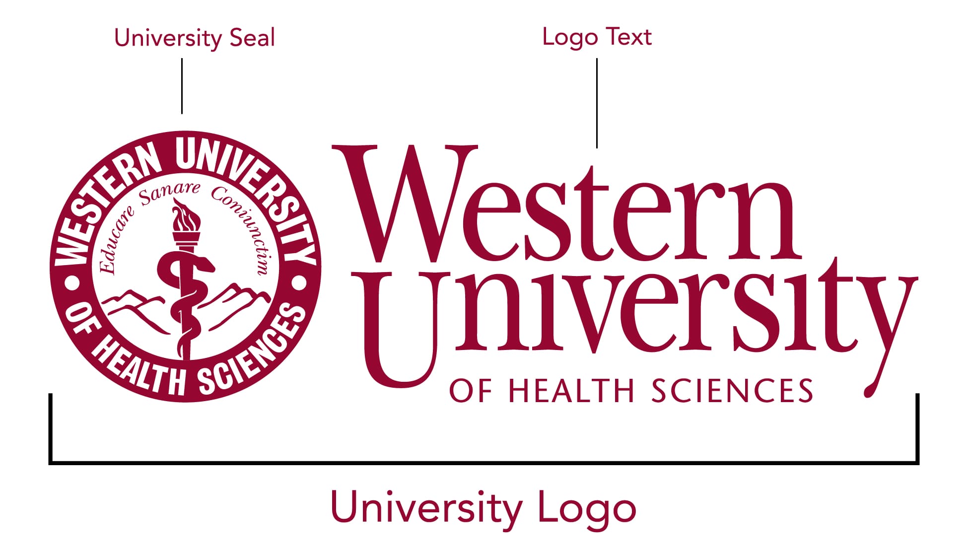
The University logo is the identifying symbol for Western University of Health Sciences. This logo was first introduced in 2003 and is intended to be used as a single unit, not as separate elements. Consistent use of the logo enhances the University’s recognition.
The circle contains the University name, the osteopathic caduceus modified with a torch, mountains representing the University’s Southern California location, and the Latin phrase Educare, Sanare, Coniunctim — which translates to To Teach, To Heal, Together — the University’s original positioning statement.
- The WesternU logo, name, seal, and wordmarks are the property of Western University of Health Sciences. Any unauthorized use or misuse is prohibited.
- The fonts used in the logo text are New Baskerville, a strong, stable font with custom scaling and kerning, and is offset by the simple and modern Stone Sans Bold.
- The logo is available in horizontal and vertical versions.
- Do not allow the University logo or wordmark to appear blurry or pixelated. High resolution raster and vector logos are available for download.
- The only acceptable colors for the University logo are all black, all white, or all burgundy. Choose the appropriate color so that the University name or logo remains legible (ex. a white logo on a dark background).
- The logo should be used in the approved forms and may not be altered — including by rotating, stretching, adding or removing elements, recreating, changing the colors, or rendering in 3-D.
- Do not place text or graphics over the logo.
- Do not shrink the logo so that it cannot be reasonably read.
- Maintain a consistent margin of clear space around the logo at all times. Clear space should be equivalent to 1⁄2 the width of circle and caduceus.
Using the University Logo when space & size is a problem
Sometimes the entire logo may not work due to space/size issues, such as on clothing or small branded promotional items. The decision to use the seal by itself should not be made by personal preference. It should only be used alone when the entire logo or wordmark will not work for a particular application. For questions, please contact Marketing and Communications.

WesternU logo History
When COMP became WesternU in 1997, the circle logo was redesigned to contained the University name, the osteopathic caduceus modified with a torch, and mountains representing the University’s Southern California location.
In 2003, the University logo was expanded to include the logo text, the Latin phrase Educare, Sanare, Coniunctim — which translates to To Teach, To Heal, Together — and a tagline.
In 2016, the tagline was removed from the logo, and the seal was cleaned up.
University Marketing and Communications has the responsibility of respectfully intercepting any and all misuses of WesternU branding. In such cases, we will make every effort to suggest and/or supply revised designs to assist our community with projects. Anyone using WesternU logos should be familiar with the institution’s logo policies.

University Wordmarks Our Name
Why is this so important? “Western” does not distinguish our brand or convey our unique position as a comprehensive graduate university for the health professions.
There are two University wordmarks: The full University name and WesternU
“Western,” “Western University,” “WU,” “WUHS” or any other combination of names, or any acronyms, are not acceptable.
New College and Department Lockups
A more modern and flexible approach to the university brand that prioritizes our University name recognition, eliminates redundancy and confusing details, and accommodate a wide-range of uses in print and digital media.
There are two types of lock-ups depending on the audience: external audiences should see our full name wordmark and internal audiences should see the WesternU wordmark.
External Audiences
The full wordmark should be used for new audiences unfamiliar with, or external to, the University including prospective students, prospective employees, broad social media audiences and donors.
- This elevates “Health Sciences” to equal stature and is legible at small sizes.
- It will work well in a variety of media including email, social media, promotional items and apparel.
- It is not necessary to use the seal with these new lock-ups, but it is an option.
- There are horizontal and stacked versions.
- The color options are two-tone burgundy, all black and all white.
Internal Audiences
The WesternU wordmark should be used for audiences familiar with, or internal to, WesternU including current students and employees, alumni, preceptors, established community partners, and targeted social media followers such as alumni Facebook groups.
- It’s less formal and more compact for email headers, digital signs or promotional items.
- It reinforces the use of our nickname and social media handles using WesternU.
- It is not necessary to use the seal with these new lock-ups, but it is an option.
- There are horizontal and stacked versions.
- The color options are two-tone burgundy, all black and all white.




Download Logos
To ensure that you are using the most up-to-date and official set of logos and lock-ups, please download from the WesternU Photoshelter. (WesternU SSO required)